Jump to AVcharts or Hazards
Radar Charts
Radar - WSIs NOWrad radar imagery displays areas where precipitation is occurring, the intensity of the precipitation,
and the type of precipitation (rain, snow, or mixed). Mixed precipitation includes any combination of rain, snow, sleet, or freezing rain.
Precipitation areas are shaded to depict the type and intensity of precipitation as shown below:
| Precip Intensity |
DBz |
Color Key |
| Light |
05-30 |
Light Greens |
| Moderate(M) |
30-40 |
Dark Green |
| Heavy(H) |
40-45 |
Yello |
| Very Heavy(V) |
45-50 |
Orange |
| Intense(I) |
50-60 |
Tan and Brown |
| Extreme |
60-75 |
Red through Purple |
The national (8 km resolution) NOWrad mosaic radar images are created by combining data from more than 130 NEXRAD sites across
the United States. Proprietary computer algorithms are used to create the seamless mosaic and eliminate ground clutter and anomalous propagation (AP).
In addition, each image is visually inspected by a specially trained meteorologist in order to remove false echoes that cannot be detected by the computer
algorithms. The result in a radar imagery product that is virtually free of false echoes (non-precipitating echos).

NEXRAD Base Reflectivity Data
Single-site NEXRAD base reflectivity data are updated every 5, 6, or 10 minutes, depending on whether the radar is in normal precipitation mode, storm precipitation mode, or clear air mode. The same NEXRAD base reflectivity information (excluding clear air mode data) is incorporated into the WSI NOWrad national and regional mosaics, except that the NOWrad images go through rigorous quality control procedures that remove most false echoes caused by ground clutter and anomalous propagation (AP). Caution must be exercised in attempting to interpret the single site NEXRAD images because they often contain "artifacts" that are not actual precipitation echoes.
About NEXRAD
NEXRAD is the commonly used acronym for the Next Generation of Weather Radar which began to be tested and implemented by the National Weather Service and the Federal Aviation Administration during the 1980s. These new Doppler radar systems, now more appropriately known as the WSR-88D (Weather Surveillance Radar -1988 Doppler), have recently replaced the aging network of WSR-57 and WSR-74 radar systems which the National Weather Service and the Federal Aviation Administration had been using for the last several decades. The WSR-88D provides several advantages over the its older predecessors, including:
* Greater Sensitivity
* Higher Resolution Data
* The ability to detect the relative motion of echoes within a storm
* Multiple volumetric views of the atmosphere
* Algorithms to estimate the amount of liquid in the atmosphere
* Algorithms to estimate the amount of precipitation that has fallen and much, much more.
Base Reflectivity is a measure of the intensity of precipitation occurring, and is reported in units of DBZ. The WSR-88D emits pulses of energy into the atmosphere at regular intervals. When this energy impacts something (i.e. a raindrop, a snowflake, a mountain, etc.), some of the energy is scattered back to the radar dish. The amount of energy which is received back at the radar dish is measured in units of DBZ (decibels). The higher the DBZ value the larger the object. Large raindrops and hail, for example, produce high DBZ values. In general, DBZ values greater than 15 indicate areas where precipitation is reaching the ground; DBZ values less than 15 usually are an indication of very light precipitation which in most cases is evaporating in the atmosphere before it reaches the ground.
 The legend on the right side of the image indicates the active operating mode, as shown below:
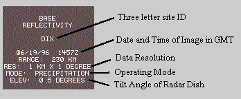
Generally speaking, when there is no precipitation within the range of the radar site (230 Km, or about 140 miles), the radar system can be switched into "clear air" mode. In clear air mode the sensitivity of the radar is increased dramatically. The WSR-88D can actually detect energy levels so small they are reported in terms of negative values ( i.e. -10 DBZ). This enables the radar to detect boundaries between air masses, temperature inversions in the atmosphere (warm air above cooler air), and non meteorological phenomena such as smoke plumes, and more. So, when you look out your window and see fair skies, yet the WSR-88D image is showing echoes over you, it generally means one of two things. First, check to see which mode the radar site is operating in. If it is in clear air mode the echoes on the image are simply indicating variations in the atmospheric conditions over your area, or some other non meteorological phenomena ( i.e. flock of birds or insects, smoke plumes, etc.) or ground clutter such as buildings, trees, hills, mountains, etc. If the radar is operating in precipitation mode, the echoes again may be caused by ground clutter. Ground clutter is most prevalent within 30 miles of the radar site.
NEXRAD VAD Winds
In the VAD Winds chart, the color of the wind barbs represents error (RMS/Knots), not wind speed. The color legend indicates the variability of the data. The higher the number, the less reliable the wind data. Altitude is marked on left side in thousands of feet above mean sea level (MSL), so the lowest altitude plotted will vary from station to station. The time at the bottom, increases left to right, varies between five, six, and ten-minute increments based on the Radar site mode. The wind barb stem points to the direction the wind is blowing "from". The flags and barbs protruding from the wind stems indicate velocity. A triangular flag equals 50 knots, A long barb equals 10 knots, and a short barb equals 5 knots. A small open circle means the wind is less than 4 knots. ND means "no data."
In terms of reliability the measurement used as a base assumes constant direction and velocity through 360 degrees. Fronts in the area or thunderstorms may cause varying direction and velocity, and reduced reliability. The difference from the base measurement determines reliability. Of the five colors on the legend, only the top two are considered data that is reliable. The middle color represents generally unreliable wind data. The bottom two colors represent wind data so unreliable it is not even plotted. Frontal passages, gusts, and other disturbed environments prevent reliable readings.
The radar samples air movement by processing "returns" from objects in the atmosphere. Uses include,
* Provides real time wind profiles for area around the radar site.
* Can identify low level wind shear.
* Monitor jet stream altitude and strength.
* Verify forecast winds aloft.
* Determine altitude with least headwind or most favorable tailwind.
* In a limited way, could determine bases and tops of clouds.
This works best with stratiform clouds.
* Aids in determining warm and cold advection.
* Aids in determining locations of fronts.
Like most weather products, information construed from VAD Wind charts should be combined with multiple sources of data to obtain an accurate picture of the current weather. Also, the date and time at the top of the right margin must be checked to confirm the use of current data.
Interpreting Radar Summary Charts
The NOWRAD Radar Summary graphics are meant to help you track storms more quickly and accurately. These images consist of echo top heights, cell movement indicators, tornado and severe thunderstorm watch boxes, and the NEXRAD Storm Table information overlaid onto the mosaic radar imagery. The radar summary graphics display cell movement and direction by arrows, with speed in knots, and the echo top heights in hundreds of feet. An "NA" on the chart indicates that the radar report from that station was "Not Available", and "NE" shows that the radar was seeing "No Echos". Severe weather watch boxes are also plotted - red boxes indicate a Tornado Watch has been issued for the area, and a blue box indicates a Severe Thunderstorm Watch is in effect for the area.
The NEXRAD storm Table data includes the following criteria:
Mesocyclone (MESO)
The NEXRAD algorithms detect a three dimensional rotating section of a storm
that is an indicator of severe weather.
Tornadic vortex signature (TVS)
Potential tornadic activity is detected by the NEXRAD algorithms within the
mesocyclone.
Hail (HAIL)
The NEXRAD algorithms are detecting the probability of hail within the storm.
Hook Echo (HOOK)
The radar observation (ROBs) is detecting a hook echo, which is an indicator
for potential tornadoes.
Watch Boxes
Thunderstorm and tornado watches issued by the Storm Prediction Center in Kansas
City MO.
Satellite Charts
IR Satellite - The satellite images displayed are infrared (IR) images. Warmest (lowest) clouds are shown in white; coldest (highest)
clouds are displayed in shades of yellow, red, and purple. Imagery is obtained from the GOES and METEOSAT geostationary satellites, and the two US Polar Orbiter
(POES) satellites.
POES satellite’s orbit the earth 14 times each day at an altitude of approximately 520 miles (870 km). As each orbit is made the satellite can view a 1,600 mile
(2,700 km) wide area of the earth. Due to the rotation of the earth the satellite is able to view every spot on earth twice each day. Data from multiple orbits
are mosaicked together to provide wide scale global and full earth views in a single image. Occasional dark triangular areas that occur on POES images are a
result of gaps in data transmitted from the orbiters.


Visible Satellite - Unlike Infrared (IR) satellite imagery, which depicts the temperature of the clouds, Visible satellite imagery is
essentially a snapshot of what the satellite sees. As the sun approaches midday over a given area, clouds will appear as bright white, as opposed to gray
at sunrise and sunset. This is due to more sunlight being reflected as the sun moves overhead. Bodies of water, including lakes and rivers, absorb more sunlight
and appear as black, with landmasses displaying as dark gray. It is also important to note that Visible imagery is only updated between sunrise and sunset,
when each satellites "flashbulb" (a.k.a. the sun) is available.

AV Charts
AIRMETS - An AIRMET (AIRmans METeorological Information) advises of weather that maybe hazardous,
other than convective activity, to single engine, other light aircraft, and Visual Flight Rule (VFR) pilots.
However, operators of large aircraft may also be concerned with these phenomena.
The items covered are:
In the AIRMET Sierra bulletin:
- Ceilings less than 1000 feet and/or visibility less than 3 miles affecting over 50% of the area at one time.
- Extensive mountain obscuration.
In the AIRMET Tango bulletin:
- Moderate turbulence.
- Sustained surface winds of 30 knots or more at the surface.
In the AIRMET Zulu bulletin:
- Moderate icing.
- Freezing levels.
These AIRMET items are considered to be widespread because they must be affecting or be forecast to affect an area of at least 3000 square miles
at any one time. However, if the total area to be affected during the forecast period is very large, it could be that only a small portion of this total
area would be affected at any one time.
AIRMETs are routinely issued for 6 hour periods beginning at 0245 UTC during Central Daylight Time and at 0145 UTC during Central Standard Time.
AIRMETS are also amended as necessary due to changing weather conditions or issuance/cancellation of a SIGMET.
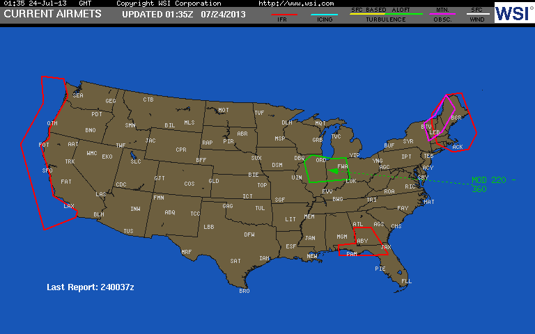
SIGMETs - A SIGMET (SIGnificant METeorlogical Information) advises of weather potentially hazardous to all aircraft other than
convective activity. In the conterminous U.S., items covered are:
- Severe icing
- Severe or extreme turbulence
- Duststorms and sandstorms lowering visibilities to less that three (3) miles.
- Volcanic Ash
In Alaska and Hawaii, SIGMETs are also issued for the following events:
- Tornadoes
- Lines of thunderstorms
- Embedded thunderstorms
- Hail greater than or equal to 3/4 inch in diameter
For the lower 48 states and adjacent coastal waters, Convective SIGMETs are issued hourly for Thunderstorm-related aviation hazards.
These SIGMET items are considered to be widespread because they must be affecting or be forecast to affect an area of at least 3000
square miles at any one time. However, if the total area to be affect during the forecast period is very large, it could be that only a small
portion of this total area would be affected at any one time.
SIGMETs are issued for 6 hour periods for conditions associated with hurricanes and 4 hours for all other events.
If conditions persist beyond the forecast period, the SIGMET is updated and reissued.
Convective SIGMETs -CONVECTIVE SIGMETs are issued in the conterminous U.S. for any of the following:
Severe thunderstorms accompanied by:
- surface winds greater than or equal to 50 knots.
- hail at the surface greater than or equal to 3/4 inches in diameter.
- tornadoes.
- Embedded thunderstorms.
- Line of thunderstorms.
- Thunderstorms greater than or equal to VIP level 4 affecting 40% or more of an area at least 3000 square miles.
Any Convective SIGMET implies severe or greater turbulence, severe icing, and low level wind shear.
A Convective SIGMETs may be issued for any convective situation which the forecaster feels is hazardous to all categories of aircraft.
Convective SIGMET bulletins are issued for the Eastern (E), Central (C), and Western (W) United States. The areas separate at 87 and 107 degrees west longitude with sufficent overlap to cover most cases when the phenomenon crosses the boundaries. Bulletins are issued hourly at Hour+55. The text of the bulletin consists of either an observation and a forecast or just a forecast. The forecast is valid for up to 2 hours.
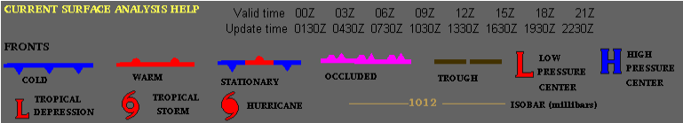
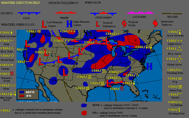
Surface Analysis and Surface Weather Prog -
Weather Depiction -
Low Level Sig Prog -
- Updated 4 times daily for the 12hour and 24hour forecast. Estimated update is around 6z,9z,17,23z
- Updated 2 times daily for the 36hour and 48hour forecast. Estimated update is around 6z, 17z
- Cloud forecast should be interpretted as satellite would
- Precip areas should be interpretted as radar would.
- MSLP ilnes are placed at an 8 millibar interval
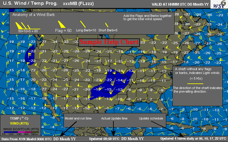
Winds Aloft -
Severe Weather Outlook -
Green - General (non-severe) thunderstorms expected
Yellow - Slight risk of severe thunderstorms expected
Red - Moderate risk of severe thunderstorms expected
Purple - High Risk of severe thunderstorms expected
Thunderstorm Probability - NGM (Nested Grid Model) is run twice a day at 0000z and 1200z. Products are updated by 0400z and 1600z respectively.
- Solid white lines are thunderstorm probability contours in 10% intervals
- Color contour lines are probabilities of severe weather in 10% intervals
- NOTE: For a thunderstorm to be classified as severe, it must produce winds greater than or equal to 58mph (50kts) and/or hailr 3/4 inch or greater in diameter.

High Level Sig Wx -
- Updated 4 times daily for the 12hour forecast. Estimated update around 6z,9z,17z,23z.
- CB areas represent thunderstroms and cumulonimbus clouds with cb areas depicted as isolated (iso), occassional (ocnl), or frequent (freq).
Station Model Plot -
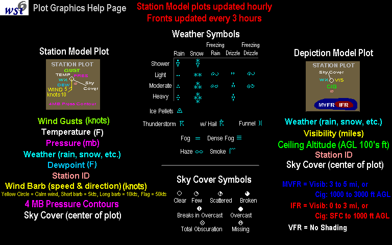 >
>
Upper Air Analysis -
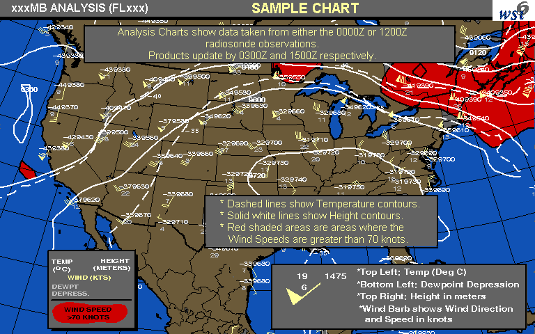
Observed Winds -The observed winds aloft charts are updated twice daily at approximately 0200Z (00Z data) and 1400Z (12Z data). Levels shown are the 2nd standard level (approximately 2,000 ft. above the surface), 14,000 ft. (600 mb level), 24,000 ft. (400 mb level), and 34,000 ft. (250 mb level). Temperatures are given in degrees Celsius.
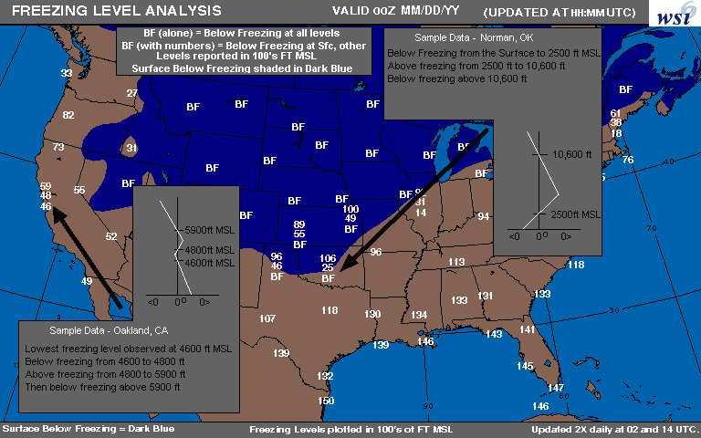
Freezing Level Analysis -
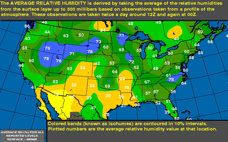
Relative Humidity -The Average relative humidity is derived by taking the average of the relative humidities from the surface layer up to 500 millibars based on observations taken from a profile of the atmosphere. These observations are taken twice a day around 12z and again at 00z.
Preciptable Water -The precipitable water (PW) graphic depicts the observed quantity of water vapor between the surface and 500mb (18,000 feet MSL). The chart shows the amount of water (inches) the air would contain if all the vapor were condensed.
Some Constants:
- Warmer air has the ability to store more water vapor, hence the amounts are generally
higher in the summer months.
- Higher elevations have less vertical atmosphere between surface and 500mb, hence they
generally have lower PW values.
Lifted/K Index -The Lifted/K Index chart is updated twice daily at approximately 0330Z (00Z data) and 1530Z (12Z Data).
The Lifted/K Index chart combines two indices commonly used to measure atmospheric instability and the related potential for thunderstorm development.
The first, the Lifted Index (upper number), is a measure of the chance of severe thunderstorms. It is the difference between the observed 500 mb temperature
and the temperature that a parcel of air would have if lifted from the boundary layer to the 500 mb level. If the temperature at 500 mb is warmer than the
parcel lifted to that level, the air is stable and the chance of thunderstorms is low; if the temperature at 500 mb is colder than the parcel lifted to that
level, the air is unstable and thunderstorms are likely. The difference in temperature is directly related to the chance of severe thunderstorms.

| Lifted Index |
Chance of Thunderstorms |
| 0 to -2 |
Weak |
| -3 to -5 |
Moderate |
| -6 or less |
Strong |
The second index, the K Index (lower number), is a measure of the probability of airmass thunderstorms.
It takes into account the temperature lapse rate between 850 mb and 500 mb, the amount of moisture at 850 mb, and the dryness of the air at 700mb.
| K Index |
Thunderstorm Probability (%) |
| Less than 15 |
near 0% |
| 15 to 20 |
20% |
| 21 to 25 |
20% to 40% |
| 26 to 30 |
40% to 60% |
| 31 to 35 |
60% to 80% |
| 80% to 90% |
20% to 40% |
| over 40 |
near 100% |
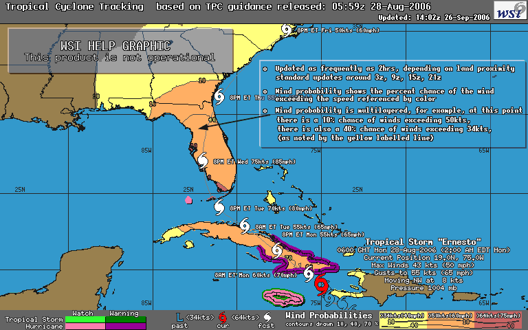
Active Tropical Storms - These charts are created in the Meteorological Operations department of WSI, using information supplied by the
Tropical Prediction Center in Miami, FL. The charts are created for tropical systems in the Atlantic and Pacific, and production begins when the Tropical
Prediction Center declares a disturbance as a Tropical Depression. Once begun, the charts are updated with every update issued by the TPC, which is every 6
hours normally, and every 2-3 hours as the storm approaches land.
The tropical system tracking charts provide information about current storms, including the latest statistics such as location, strength, and movement,
categorical wind probabilities, watches and warnings in effect at the time, and 12 hr through up to120 hour forecasted positions and strengths.
The status of the storm is presented with the icon used to pinpoint location. A Tropical Depression is represented by an "L".
A Tropical Storm is represented by an icon with an open center, and a Hurricane by the same icon with a closed center.
Near the icon, the latest information about the storm is listed in the following order: name of the storm, time and date of the advisory from
which this information was taken, latitude and longitude of the center of the storm, highest sustained winds recorded in the storm, direction and
speed of movement of the storm, and the central pressure of the storm. Wind speed is also provided for the forecasted positions of the storm.
Any watches or warnings for areas being affected are highlighted along the coast in the appropriate color. Refer to the color chart on the
image for the type of watch or warning in effect. A watch indicates that conditions are likely for that particular storm to affect the region,
a warning indicates that the conditions are imminent.
The color filled wind probability contours indicate the overall likelihood of winds reaching the thresholds of 40mph (yellow),
60mph(orange) and 75mph(dark red).There are dark line contours within these filled areas which show the probability of that threshold being met.
There are 3 probability levels contoured, 10%, 40% and 70%, with the numeric label matching the color of the threshold being described.
Volcanic Ash Charts -The Volcanic Ash Forecast graphic depicts the concentrations of ash following a volcanic eruption.
It is a composite of volcanic ash particle transport and dispersion from the surface to FL550. The graphic displays the volcano name, longitude and latitude,
eruption date and time, eruption duration, summit elevation of the volcano, initial cloud ash column height, the AVN run the ash forecast is based off of,
and valid forecast dates and times.
The Volcanic Ash Forecast chart is based off the Volcanic Ash Forecast Transport and Dispersion (VAFTAD) Chart.
The VAFTAD is a three-dimensional time-dependent dispersion model developed by the National Oceanic and Atmospheric Administration (NOAA)
Air Resources Laboratory (ARL). It uses National Center for Environmental Prediction (NCEP) AVN model winds aloft data to determine the location of
ash concentrations.
The VAFTAD model is triggered by the occurrence of volcanic eruption. PIREPs and satellite imagery play an important part in determining if the model
will be run. *Minor eruptions could be happening, but they may not be significant enough to cause the VAFTAD model to be triggered, and the Volcanic Ash Forecast graphic to be drawn.
In this case, the following statement will be posted on the graphic:
PRESENTLY THERE ARE NO SIGNIFICANT AREAS OF
VOLCANIC ASH EXPECTED
UPDATED 12:00 GMT (current date)
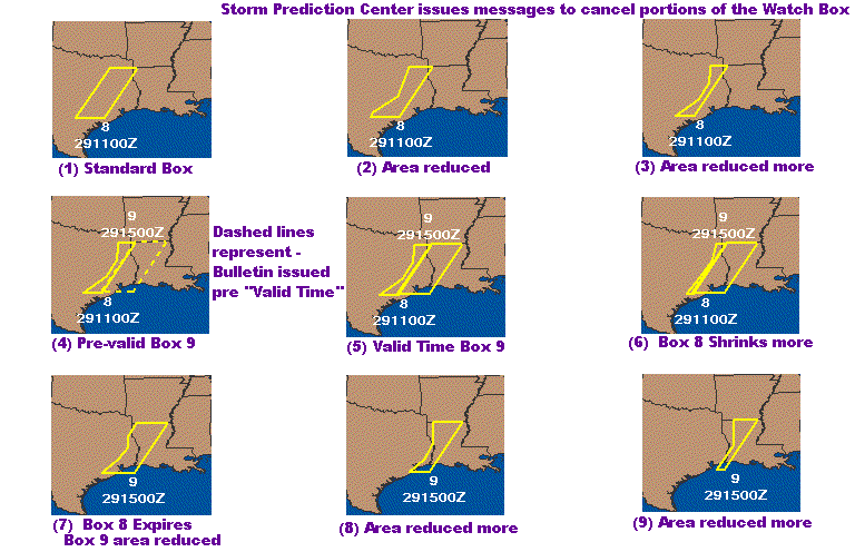
Watches -Weather Watches are issued by the Storm Prediction Center (SPC). They are issued in advance of expected severe thunderstorms
or tornados. The "Current Watches" advisory graphic will plot these watch boxes in yellow for severe thunderstorm watches, and red for tornado watches.
The watch number and expiration time will also be plotted near the box. Occasionally the SPC issues a watch which is not immediately valid, but scheduled
to become valid within an hour. These "impending" Watch Boxes will be plotted with dashed lines from the time of issuance until the time they are scheduled
to become valid. At "valid" time, the dashed lines change to solid lines.
The SPC will also issues status messages referring to valid watch boxes. These messages will often cancel portions of the original box, as the severe
weather threat diminishes. The effect on the plot will be for the box to become "trimmed" away.
Hazards Charts
Hurricane Tracking/Forecast Charts
These charts are created in the Meteorological Operations department of WSI, using information supplied by the Tropical Prediction Center in Miami, FL. The charts are created for tropical systems in the Atlantic and Pacific, and production begins when the Tropical Prediction Center declares a disturbance as a Tropical Depression. Once begun, the charts are updated with every update issued by the TPC, which is every 6 hours normally, and every 2-3 hours as the storm approaches land.
The tropical system tracking charts provide information about current storms, including the latest statistics such as location, strength, and movement, categorical wind probabilities, watches and warnings in effect at the time, and 12 hr through up to120 hour forecasted positions and strengths.
The status of the storm is presented with the icon used to pinpoint location. A Tropical Depression is represented by an "L". A Tropical Storm is represented by an icon with an open center, and a Hurricane by the same icon with a closed center. Near the icon, the latest information about the storm is listed in the following order: name of the storm, time and date of the advisory from which this information was taken, latitude and longitude of the center of the storm, highest sustained winds recorded in the storm, direction and speed of movement of the storm, and the central pressure of the storm. Wind speed is also provided for the forecasted positions of the storm.
Any watches or warnings for areas being affected are highlighted along the coast in the appropriate color. Refer to the color chart on the image for the type of watch or warning in effect. A watch indicates that conditions are likely for that particular storm to affect the region, a warning indicates that the conditions are imminent.
The color filled wind probability contours indicate the overall likelihood of winds reaching the thresholds of 40mph (yellow), 60mph(orange) and 75mph(dark red).There are dark line contours within these filled areas which show the probability of that threshold being met. There are 3 probability levels contoured, 10%, 40% and 70%, with the numeric label matching the color of the threshold being described. See the Hurricane Tracking/Forecast Sample chart for more details.
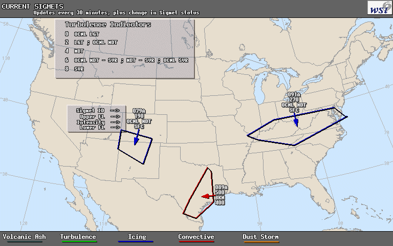
WSI SIGMETs -
Issued for significant turbulence, convection, icing, volcanic ash, or dust storm advisories. WSI SIGMETs are valid for up to 6 hours and are issued and updated as necessary.
Icing - moderate of greater icing forecasted for the highlighted area
Convection - 35% thunderstorm coverage or more
Volcanic ash - Ash above FL180 and forecasted to impact flight operations
Dust - Significant dust forecasted to reduce surface visibilities.
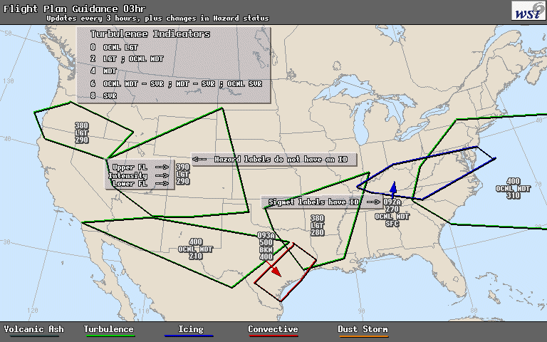
WSI Flight Plan Guidance (FPG) -
Depicts potential flight hazards including turbulence, thunderstorms, icing, volcanic ash, and dust storms. The interactive map display also includes ozone and other significant events.
Issued in 3 hour increments through +12 hours and updated a minimum of every 3 hours.